Earth Toned Minimalism is Back (But Not Boring)
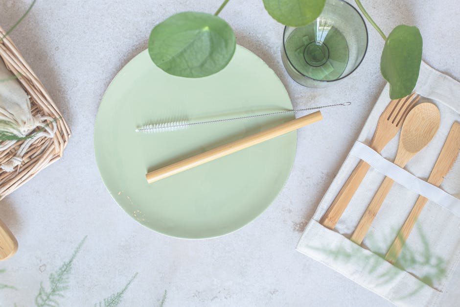
Minimalism isn’t going anywhere, but the cold, gallery white version of it is. In today’s luxury spaces, sterile has given way to soulful. Rich clays, sage greens, and warm taupes are dominating high end palettes all earthy, grounded tones that still feel fresh. They invite calm, but with character.
The trick to pulling it off? Layered texture. Designers are stacking tone on tone through different surfaces: think suede walls against linen drapes, or taupe stone floors paired with soft wool upholstery. It’s all about visual depth that doesn’t scream for attention.
Materials matter. Velvet, linen, aged wood, even matte ceramics they all play into this elevated quiet. When the colors are subtle, the touch and feel do the heavy lifting. That’s the new minimalist luxe: understated, tactile, and never flat.
High Drama Contrast is Making a Statement
Contrast isn’t just back it’s loud, deliberate, and confidently bold. Design pros are leaning hard into sharp pairings like black and brass or ivory and ink to claim instant attention. These combos aren’t subtle, and that’s the point. They create visual tension that feels curated, not chaotic. It’s a move that says the space has direction, purpose, and very little interest in playing it safe.
Color blocking is getting architectural. Think more than just accent walls now we’re seeing defined blocks of dark and light tones on ceilings, floors, and built ins. Clean lines cut through space with graphic precision. Used right, it lifts even the simplest room into something sophisticated and photo ready.
In the luxe design scene, contrast sends a clear message: whoever lives here knows what they like, and isn’t afraid to claim it. It’s confidence made visual and that’s always in style.
Jewel Tones Reimagined

Forget subtle. Saturated jewel tones think emerald, sapphire, garnet are taking center stage in luxury interiors, but with new restraint. These aren’t the over polished, overused versions that scream old world formality. Instead, designers are leaning into rich hues with matte or lacquered finishes, placing them smartly on velvet seating, glass pendants, and accent lacquered walls.
It’s about calculated indulgence. A deep green velvet sofa or a ruby toned lacquered cabinet draws the eye and holds it. These colors don’t need volume; they need contrast and purposeful placement. When used sparingly but boldly, they shift the entire temperature of a space, adding intensity without tipping into theatrical excess.
It’s drama with discipline and it’s everywhere right now.
Pattern Play: Go Bolder or Go Home
In the luxury design world, subtlety’s taking a backseat. Pattern is where personality shows up and in 2024, bigger is better. We’re seeing grand scale florals sprawling across accent walls and upholstery, abstract geometrics stretching from floor to ceiling, and surfaces think wallpaper, stone, textiles that layer texture like a story unfolding one chapter at a time.
But bold doesn’t mean chaotic. The best designers are mixing motifs with a clear hand. Combining a graphic rug with soft botanical curtains works when the color palette ties them together. Intention is everything. When patterns clash without purpose, the space turns noisy. When they’re balanced through common tones, scale differences, or repetition they invite curiosity without overwhelming the room.
Upholstery gives you major lift here. It’s your texture and pattern delivery system, whether you’re working with tightly tailored stripes or freeform painterly prints. Rugs and backsplashes are doing heavy lifting, too no longer just basics, they’re statement pieces that anchor your visual storytelling.
Ready to push the limits? See more on bold patterns & textures.
Heritage Prints with a Modern Edge
Classic never goes out of style, but in the luxury design world, it evolves with a twist. In 2024, beloved heritage patterns are resurfacing in high end spaces but with smart, contemporary updates that feel anything but dated.
Traditional Motifs, Reimagined
Designers are pulling from the past to infuse spaces with narratives and depth:
Toile: No longer confined to soft countryside scenes modern takes feature bold color palettes, unexpected subjects, and scale play.
Chinoiserie: Still delicate, but injected with bolder hues or metallic inlays for a fresher aesthetic.
Art Deco: Making a strong comeback through geometric lines and rich materials, often layered over more minimalist backdrops.
Modern Touches That Matter
What separates current renditions from pure revival is a strategic application of new design elements:
Color Shifts: Swapping traditional muted shades for daring navy, aubergine, or emerald reinvigorates nostalgic patterns.
Oversized Scaling: Enlarging prints adds impact, creating statement moments across walls or upholstery.
Metallic Accents: Gold, bronze, and silver threading or foil finishes add a high shine edge that nods to past luxury without feeling dated.
Bridging Past and Present
The result? A look that honors history while speaking to a modern, design literate audience. These updated heritage prints serve as both decorative features and storytelling elements, creating spaces that are rich in character without sacrificing sophistication.
Elegance can have an edge and in today’s luxury design scene, it should.
The Luxury Palette: Final Word
Color as a Design Force
In luxury spaces, color is more than a background element it’s a driver of mood, identity, and spatial atmosphere. Whether it’s a moody garnet velvet or a minimalist taupe wall, the color choices set the emotional tone of a room before a single detail is noticed.
Color defines the first impression of a space
Subtle tones can evoke calm, while bold hues signal confidence
Thoughtful integration creates cohesion between form and feeling
Beyond Trend: The Role of Contrast and Materiality
Luxury design in 2024 isn’t about following fleeting trends. Instead, it’s about mastering the elements that make a space feel both current and enduring.
Contrast: Sharp color pairings or rich shade layering adds depth and clarity
Materiality: Velvet, stone, glass, and other tactile finishes bring color to life
Scale: Oversized color applications and bold focal points communicate intention
These tools help transform color from a decorative decision into a storytelling device.
Risk, Reward, and Rising Expectations
High end clients often once color cautious are now embracing bolder palettes, driven by designers willing to propose unconventional ideas with conviction.
Clients are more open to deep, saturated tones and unexpected combinations
Designers are re educating clients on the power of color to create emotion
Calculated risks are translating into standout, press worthy designs
Bottom line: In luxury today, confidence in color isn’t optional it’s essential.
Tap into trending style inspiration with more on bold patterns & textures
 Smart Home Technology Consultant
Meagan Kanedooray serves as Luxe House Maker’s smart home technology consultant, with extensive experience in integrating advanced tech into luxury homes. Specializing in home automation, security systems, and energy-efficient solutions, Meagan helps readers transform their living spaces into seamless, tech-enabled environments. Her expertise in cutting-edge technologies ensures that Luxe House Maker’s audience stays informed about the latest innovations that enhance convenience, safety, and sustainability in luxury living. Meagan’s deep understanding of smart home trends makes her an invaluable resource for those looking to elevate their homes with the latest advancements in technology.
Smart Home Technology Consultant
Meagan Kanedooray serves as Luxe House Maker’s smart home technology consultant, with extensive experience in integrating advanced tech into luxury homes. Specializing in home automation, security systems, and energy-efficient solutions, Meagan helps readers transform their living spaces into seamless, tech-enabled environments. Her expertise in cutting-edge technologies ensures that Luxe House Maker’s audience stays informed about the latest innovations that enhance convenience, safety, and sustainability in luxury living. Meagan’s deep understanding of smart home trends makes her an invaluable resource for those looking to elevate their homes with the latest advancements in technology.